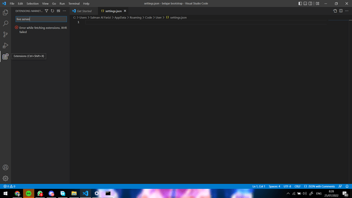
Selamat pagi, saya mau tanya kenapa ada notifikasi error while fetching extension ya?
Hi @Salman_Al_Farizi ,
Kendala seperti ini biasa nya karena kendala koneksi. Apakah masih mengalami hal yang sama ?
masih kak, tapi saya udah punya solusi untuk langsung download extension di website https://open-vsx.org/ setelah itu tinggal import manual extension yang sudah di download tadi
1 Like
<!-- Required meta tags -->

<meta charset="utf-8" />

<meta name="viewport" content="width=device-width, initial-scale=1" />

<!-- Bootstrap CSS -->

<link href="https://cdn.jsdelivr.net/npm/bootstrap@5.0.2/dist/css/bootstrap.min.css" rel="stylesheet" integrity="sha384-EVSTQN3/azprG1Anm3QDgpJLIm9Nao0Yz1ztcQTwFspd3yD65VohhpuuCOmLASjC" crossorigin="anonymous" />

<style>

        .Hello{

           background-color:aquamarine;

        }

        .world{

           background-color:chartreuse;

        }

    </style>

    <title>Hello,world!</title>

</head>

<body>

    <div class="con■■■ner">

        <div class="row">

            </div class="col hello">

               <!--col-6-->

               <h1>Hello</h1>

            </div>

            </div>

            </div class="col world">

             <!--col-6-->

             <h1>world!</h1>

            </div>

            </div>

                <div class="row">

                    </div class="col>

                    <div class="accordion" id="accordionExample">

                    <div class="accordion-item">

                    <h2 class="accordion-header" id="headingOne">

                <button class="accordion-button" type="button" data-bs-toggle="collapse" data-bs-target="#collapseOne" aria-expanded="true" aria-controls="collapseOne">

                  Accordion Item #1

                </button>

              </h2>

              <div id="collapseOne" class="accordion-collapse collapse show" aria-labelledby="headingOne" data-bs-parent="#accordionExample">

                <div class="accordion-body">

                  <strong>This is the first item's accordion body.</strong> It is shown by default, until the collapse plugin adds the appropriate classes that we use to style each element. These classes control the overall appearance, as well as the showing and hiding via CSS transitions. You can modify any of this with custom CSS or overriding our default variables. It's also worth noting that just about any HTML can go within the <code>.accordion-body</code>, though the transition does limit overflow.

                </div>

              </div>

            </div>

            <div class="accordion-item">

              <h2 class="accordion-header" id="headingTwo">

                <button class="accordion-button collapsed" type="button" data-bs-toggle="collapse" data-bs-target="#collapseTwo" aria-expanded="false" aria-controls="collapseTwo">

                  Accordion Item #2

                </button>

              </h2>

              <div id="collapseTwo" class="accordion-collapse collapse" aria-labelledby="headingTwo" data-bs-parent="#accordionExample">

                <div class="accordion-body">

                  <strong>This is the second item's accordion body.</strong> It is hidden by default, until the collapse plugin adds the appropriate classes that we use to style each element. These classes control the overall appearance, as well as the showing and hiding via CSS transitions. You can modify any of this with custom CSS or overriding our default variables. It's also worth noting that just about any HTML can go within the <code>.accordion-body</code>, though the transition does limit overflow.

                </div>

              </div>

            </div>

            <div class="accordion-item">

              <h2 class="accordion-header" id="headingThree">

                <button class="accordion-button collapsed" type="button" data-bs-toggle="collapse" data-bs-target="#collapseThree" aria-expanded="false" aria-controls="collapseThree">

                  Accordion Item #3

                </button>

              </h2>

              <div id="collapseThree" class="accordion-collapse collapse" aria-labelledby="headingThree" data-bs-parent="#accordionExample">

                <div class="accordion-body">

                  <strong>This is the third item's accordion body.</strong> It is hidden by default, until the collapse plugin adds the appropriate classes that we use to style each element. These classes control the overall appearance, as well as the showing and hiding via CSS transitions. You can modify any of this with custom CSS or overriding our default variables. It's also worth noting that just about any HTML can go within the <code>.accordion-body</code>, though the transition does limit overflow.

                </div>

              </div>

            </div>

          </div>

  <div class="accordion-item">

    <h2 class="accordion-header" id="headingThree">

      <button class="accordion-button collapsed" type="button" data-bs-toggle="collapse" data-bs-target="#collapseThree" aria-expanded="false" aria-controls="collapseThree">Accordion Item #3</button>

    </h2>

    <div id="collapseThree" class="accordion-collapse collapse" aria-labelledby="headingThree" data-bs-parent="#accordionExample">

      <div class="accordion-body">

        <strong>This is the third item's accordion body.</strong> It is hidden by default, until the collapse plugin adds the appropriate classes that we use to style each element. These classes control the overall appearance, as well

        as the showing and hiding via CSS transitions. You can modify any of this with custom CSS or overriding our default variables. It's also worth noting that just about any HTML can go within the <code>.accordion-body</code>,

        though the transition does limit overflow.

      </div>

    </div>

  </div>

</div>

<!-- Optional JavaScript; choose one of the two! -->

<!-- Option 1: Bootstrap Bundle with Popper -->

<script src="https://cdn.jsdelivr.net/npm/bootstrap@5.0.2/dist/js/bootstrap.bundle.min.js" integrity="sha384-MrcW6ZMFYlzcLA8Nl+NtUVF0sA7MsXsP1UyJoMp4YLEuNSfAP+JcXn/tWtIaxVXM" crossorigin="anonymous"></script>

<!-- Option 2: Separate Popper and Bootstrap JS -->

<!--

<script src="https://cdn.jsdelivr.net/npm/@popperjs/core@2.9.2/dist/umd/popper.min.js" integrity="sha384-IQsoLXl5PILFhosVNubq5LC7Qb9DXgDA9i+tQ8Zj3iwWAwPtgFTxbJ8NT4GN1R8p" crossorigin="anonymous"></script>

<script src="https://cdn.jsdelivr.net/npm/bootstrap@5.0.2/dist/js/bootstrap.min.js" integrity="sha384-cVKIPhGWiC2Al4u+LWgxfKTRIcfu0JTxR+EQDz/bgldoEyl4H0zUF0QKbrJ0EcQF" crossorigin="anonymous"></script>

-->

